Poster Research
Monday, 14 March 2011
Monday, 27 September 2010
Film Poster Analysis
The Proposition
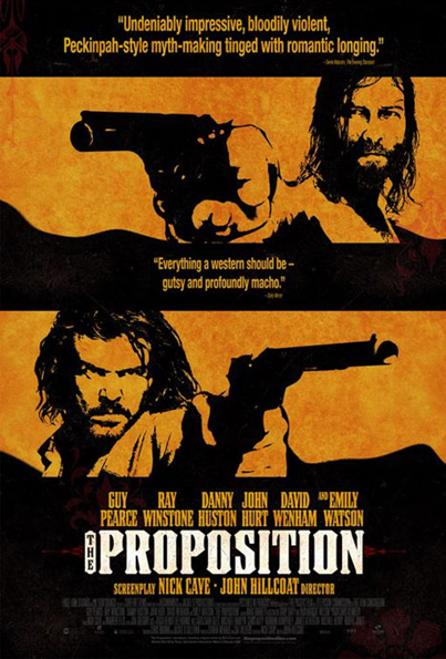
The poster below is advertising the film “The Proposition” (2006, in the UK). The film stars such names as Guy Pierce and Ray Winstone. The tagline of the film is “The Land will be civilised”.
The film is summarised as follows:
When considering how much of this plot is given away in this poster we can only assume some conflict between the two men on the poster, but not much else. We now have to decide whether to follow these conventions after analysing more Western film Posters."

Firstly the colours used are conventioal of a number of western film posters, particularly the more modern ones. The black and light brown reflect the colours of the harsh Australlian outback in this case. The light brown also appears to be immitating the paper used in the days of the old west for wanted posters for example. The font used also reflects this, with its rough edges and faded colour it represents the tough lives that the men and women of this era had.
The film is titled "The Proposition" as to reflect the plot of the film. One man is given a proposition: to save his younger brother from the gallows, he must kill his older brother.The white font used for the title "The Proposition" is perhaps used to represent that this proposition will be the light in the darkness, that if he does what he is told everything will work out for him. This may also represent that working for the law and doing what is "right" and is better than being an outlaw in an uncivilised land. The fact that there is more black than white suggests that there are more outlaws than lawmen; this may be one of the reasons that the lawmen are using one to do their job.The two characters on the poster appear to be two of the most important in the film, if not the main characters. They appear to be in the process of a confrontation, however these two images could have been taken from any moment in the film. The fact they appear to be in the middle of a confrontation suggests that this film will have a number of these or similar acts of violence and possible retribution.
The camera shots are close-ups of the two characters, this may represent a close relationship between the two. There is no angles on the shots showing that the two are level one is not more important than the other.
It is hard to tell the lighting in this image as it has been modified, this may mean that the lighting in the shot is less important. However the characters appear to have a bright light on them, judging by the background it would seem to be sunlight that is shining down onto them. This would represent the heat of the west, or in this case, Australia.
They character at the bottom of the image appears to be wearing a duster coat or similar style jacket. This clothing was typical of the time period. They are both holding either a short or long barrelled revolver, this was conventional of the time an may even be a colt peacemaker (The most famous revolver of the time).
They also both have beards and long hair. Most men in those days did, however not all. This represents the roughness of the lives they have lived, which has aged them.
Scattered on the page are quotes from reviews. These make the film seem more appealing to the viewer as they understand that a professional who watches many films has reviewed this one as being exceptional. We will not have any of these quotes on our film poster as our poster is for a film that will not be out foe some time and will not have been reviewed.
The credits at the bottom are simply to give the named people credit, it does seem as they were meant to be read as they are coloured dark grey to blend into the background and will take the readers attention away from the main attraction.
The names of actors and the director are also included for the same reason as the credits, however these are meant to be read to give the viewer an idea on the quality of the actors in it almost. As well as the quality of the film judging by the directors previous accomplishments. The surname of the actors are usually in a bigger font than the forename, this would be as people are more likely to recognise "Winstone" than "Ray" for example. So this poster breaks conventions in this sense.
Below are a number of similar film posters to advertise the same film, I feel they are just as effective but each image will mean something different to the one used in the one above.
We hope to create something just as effective.
 |
| Alternate film posters |
Subscribe to:
Comments (Atom)